Friends… Music Compilation
Every year, Portland-based record label Tender Loving Empire releases a music compilation on two physical CD’s. Fans await the music and unique packaging in equal measure.
During my 6 year stint as Creative Director at TLE, I oversaw the yearly magic of this process from collecting the music and arranging the track list to designing the packaging. The first versions of the compilation, volumes 1 through 3, had brown chipboard cases with hand-silkscreened art, all printed in-house so each had a distinctly handmade feel.
In 2010, CD sales were beginning to slump and the whole music industry was looking for interesting ways to sell music. So, while preparing Volume 4, we decided to try something different, too. We enlisted renowned designer Elaine Fong (Of Montreal, IDEO, Blue Bottle) to guide us through our departure from our internal norm. Elaine had been pushing the boundaries of album packaging most notably with her radically non-conventional designs for Of Montreal’s Skeletal Lamping. She and I worked together to shift the compilation series in a new direction.
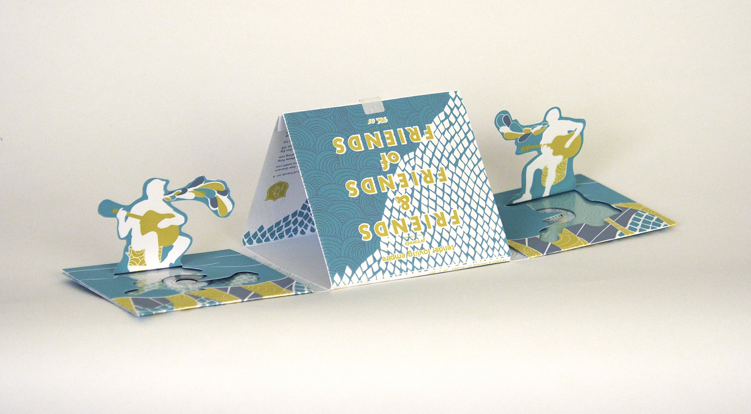
The result was an entire world within a simple CD package. Using die cuts and pop-ups, packaging could be could converted from a what appeared to be a standard CD case into a scene from a hidden forest. In keeping with our prior tradition, the package was a 3-color, handmade silkscreen.

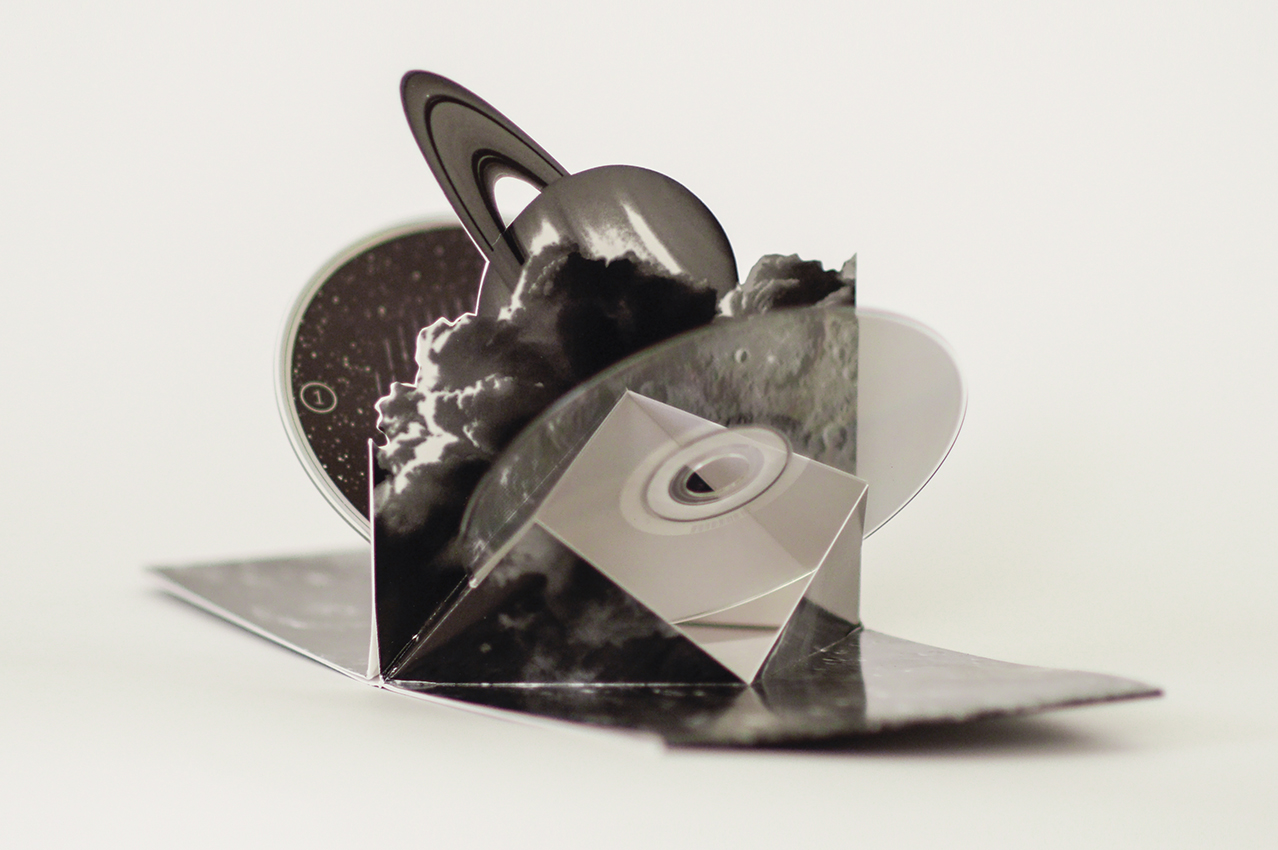
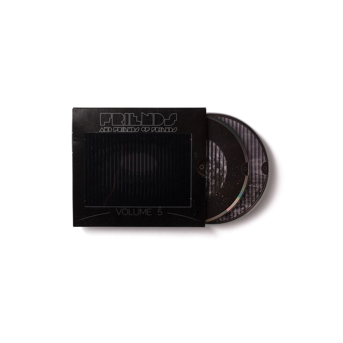
On the heels of a majorly successful Volume 4, we wanted to really outdo ourselves with Volume 5. Using another custom die, we built a 3-dimensional pop-up scene taking place on a distant moon. When users pulled the main CD package from its slip-case it fired a slit-scan animation of a galaxy spinning.


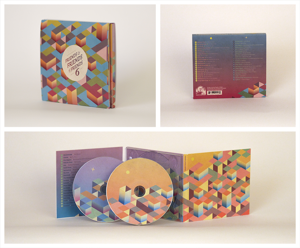
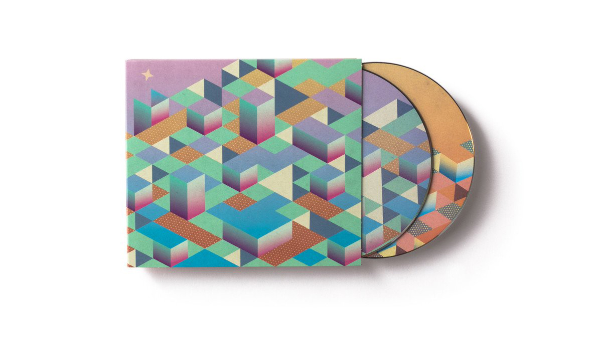
Volume 6 fell in line with the geometric zeitgeist of 2013. In a isometric cityscape, two vibrant times of day are illustrated on the two opposing sides of the package.
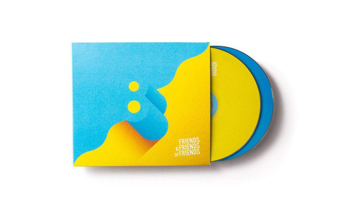
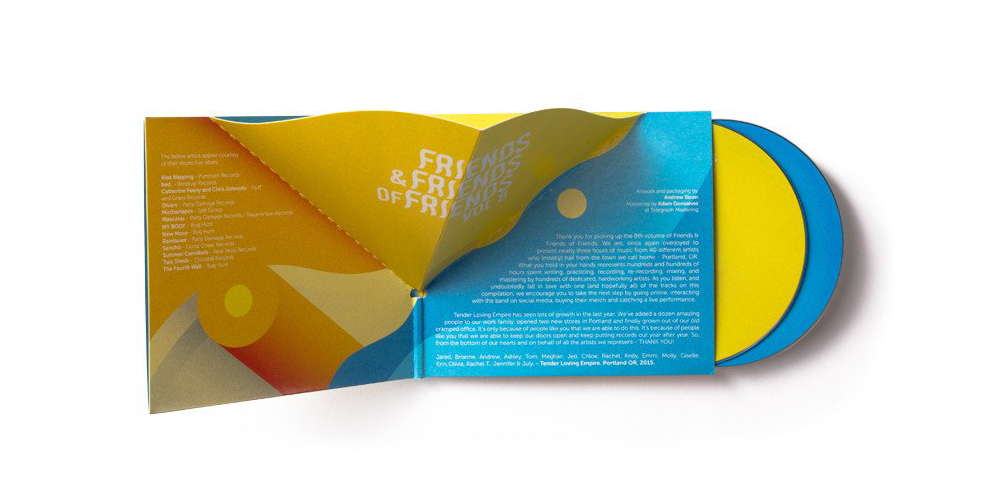
In 2014, knowing that our more brightly colored albums sold the best but also seeing minimalism coming into vogue, it was important to us to intentionally appeal to our trend-sensitive target audience. Simple line work and custom typography the anchored the simple design of Volume 7 with ample space and color pops keeping it breezy and carefree.